Table of contents
If there is any nightmare for any frontend developer out there it is most probably dealing with responsive layout and as flutter developer we are no exception to this, has you might know already flutter is used to create cross-platform applications which means with one code base your app can run on different platforms be it android, ios or even web. Therefore adding responsiveness to your application might be deemed necessary.
Two simple ways to add responsiveness
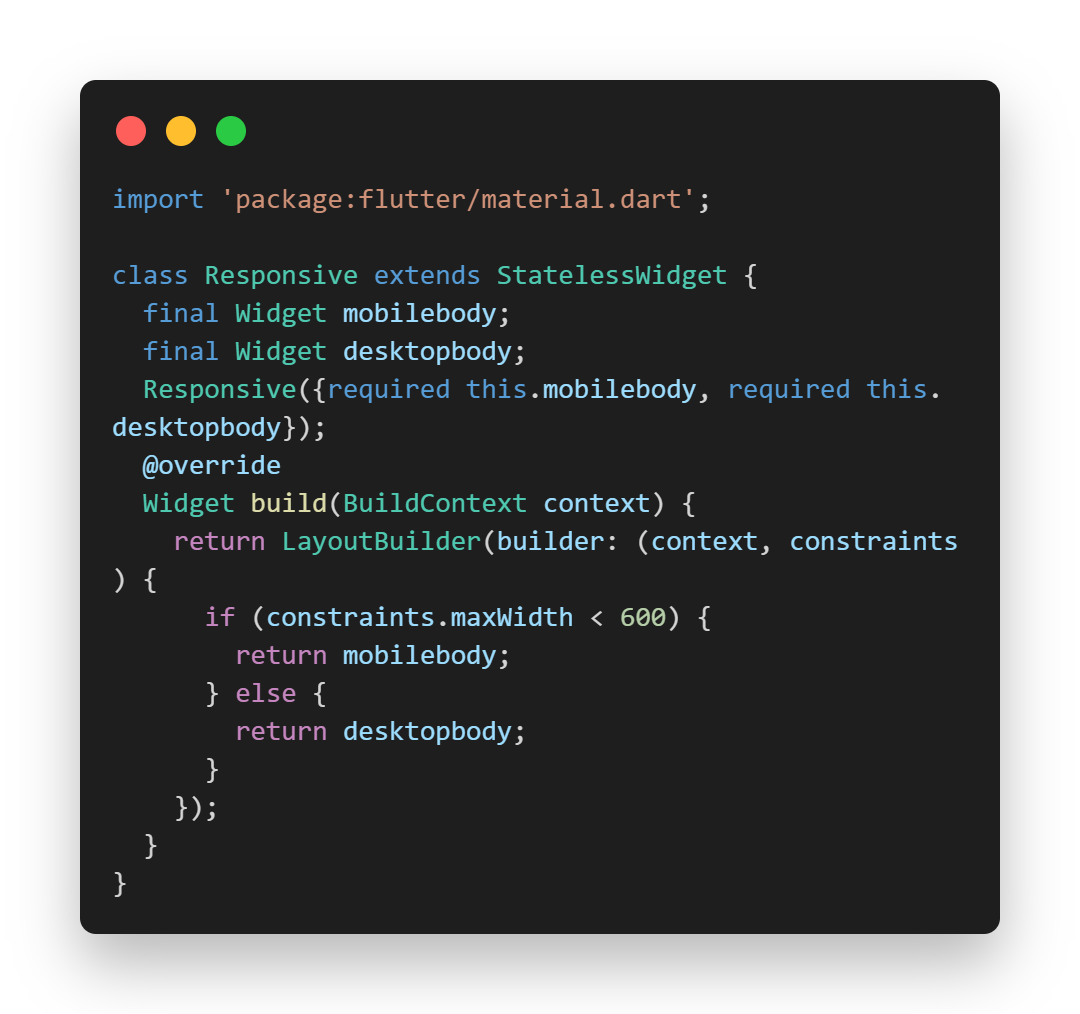
The first method is by using the “layoutbuilder” widget in flutter, this is to get the screen width of our device. If the the screen size of our device should exceed the max value the desktop/tablet view should be displayed if not the mobile view should be displayed. Let see how we can go about doing this.
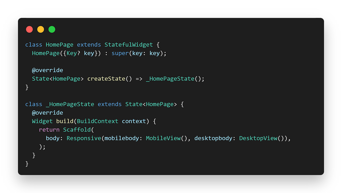
Firstly we create a new file called “responsive.dart” this will handle the layoutbuilder widget.Then we go to our homepage file under the scaffold in our body agurment we call the Responsive class.

Then we go to our homepage file under the scaffold in our body argument we call the Responsive class.

So then our code for the mobile view we go into the class mobileView while the one for desktop will go into the desktopView.
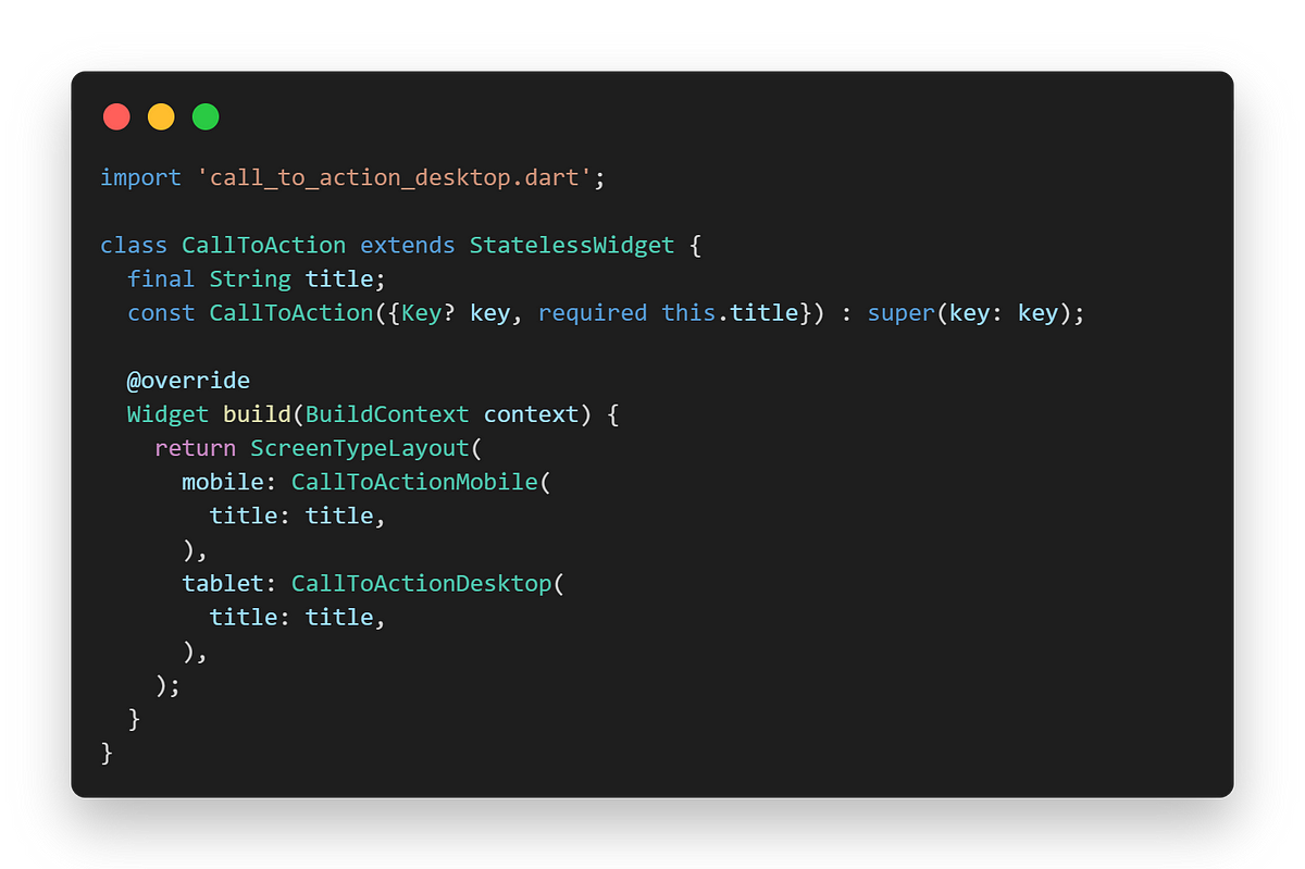
The second method is by using the package “responsive_builder: ^0.6.4” You can check more on it on pub.dev it is very similar to the first method but the difference is you do not have to specify the screen width the package got that covered. How it works is by using a widget that can be found after installing the package called “ScreenTypeLayout” and this has two main arguments you have to fill the mobile and the tablet/desktop.

Your code for the mobile view goes into the mobile and the same goes for the tablet.
Handling responsiveness is always a pain in the neck and that is why it is always a nightmare for developers, but I hope with this you have an idea of how you can go around it.
